As a product design intern, I worked with VP of Design to visualize the initial concept, map out the user flow, quickly iterate on screen design and deliver the spec and assets to the engineering team.
OVERVIEW
What we do at HomeCourt
HomeCourt is an interactive basketball app that helps anyone get better. Powered by NEX Team's computer vision technology and AR, HomeCourt gamifies the basketball training experience making it more like playing a video game. It also tracks your performance and stats allowing you to be discovered by the NBA, an official partner of HomeCourt.
After a series of chats and surveys with our core users during the 2020 Q3, we found out that the users were looking for more content as they quickly ran out of drills to play. Instead of expanding our drill catalog, we took a deeper dive into what is causing users to ask for more.
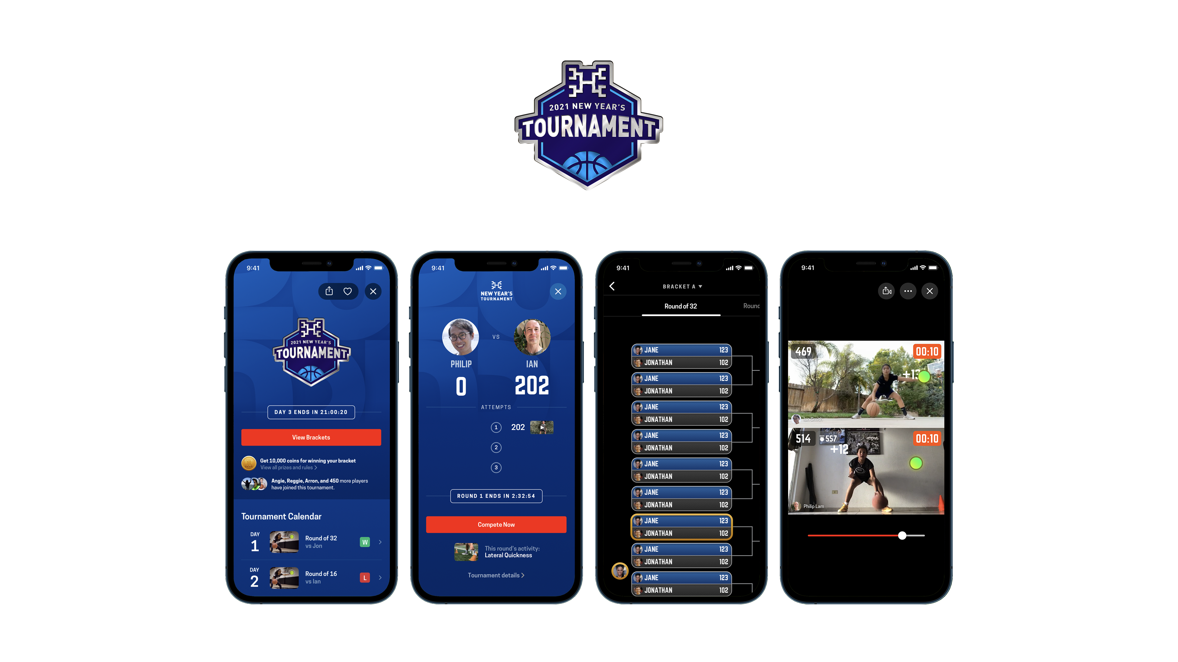
HomeCourt 2021 New Year's Tournament
Taking advantage of the fact that players have access to our product all around the world, we've created the first-ever worldwide virtual basketball tournament of its kind. Players can show off their ball-handling skills to the global community and earn prizes as they advance through the bracket.
CAVEAT
Short time frame, Lean development
Due to the nature of a start-up environment, this project is more focused on fast iterations and deployment rather than heavy research.
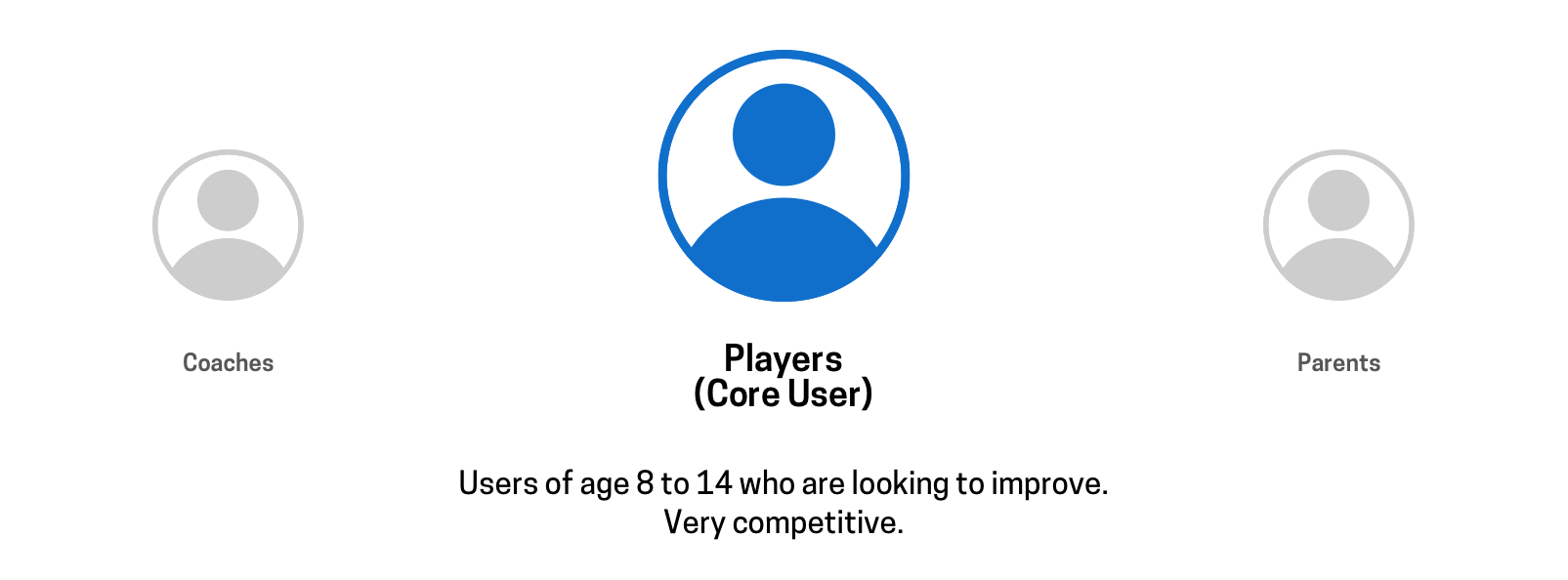
REDEFINING CORE USERS
Focusing on aspiring ballers
After the summer pandemic user boost, we decided to redefine our core user and refocus on their needs. Many of our existing users who are extremely active were players of age 8 to 14, who were extremely motivated and actively seeking to improve their game.
USER NEEDS
Competition is the key motivator
Our surveys and interviews with the core users showed that they find competition as the key motivator in their game. A lot of coaches, not only players, were using competition as a tool to engage their players in training. This insight had led us to plan our next content to be a new format of competition.
How Might We create a new engaging format of competition?
INSIGHT
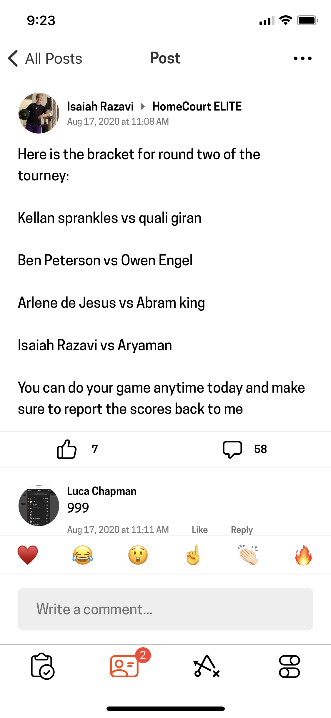
Users were throwing their own tournament
We discovered that our core users were already hosting tournaments on their own in our in-app community. Although everything was done manually and there was nothing visually exciting, it still showed high user engagement. Combined with a heavy volume of direct requests for tournaments, this finding gave us confidence to move foward with tournament as our solution.
CONCEPT DEVELOPMENT
Hackathon: A Virtual Competition
At our company-wide week long Hackathon, our team quickly developed a virtual competition concept based on the traditional basketball game of HORSE and produced a vision video to visualize the experience (also because we didn't have engineers in our team to build it 😢). This concept got many of us excited and helped imagine what the experience might look like.
PROJECT GOAL & SCOPE
Create an MVP framework for recurring tournaments
The goal of the project was to create a framework for HomeCourt tournaments that can be reused regularily to host with different themes. With every tournament we would collect feedback and improve the framework to eventually allow the users to create their custom tournaments. For the first round of release we decided to zero in on the head-to-head experience of the virtual competition that we revolved our Hackathon concept around.
PLANNING
Building architecture and scenarios
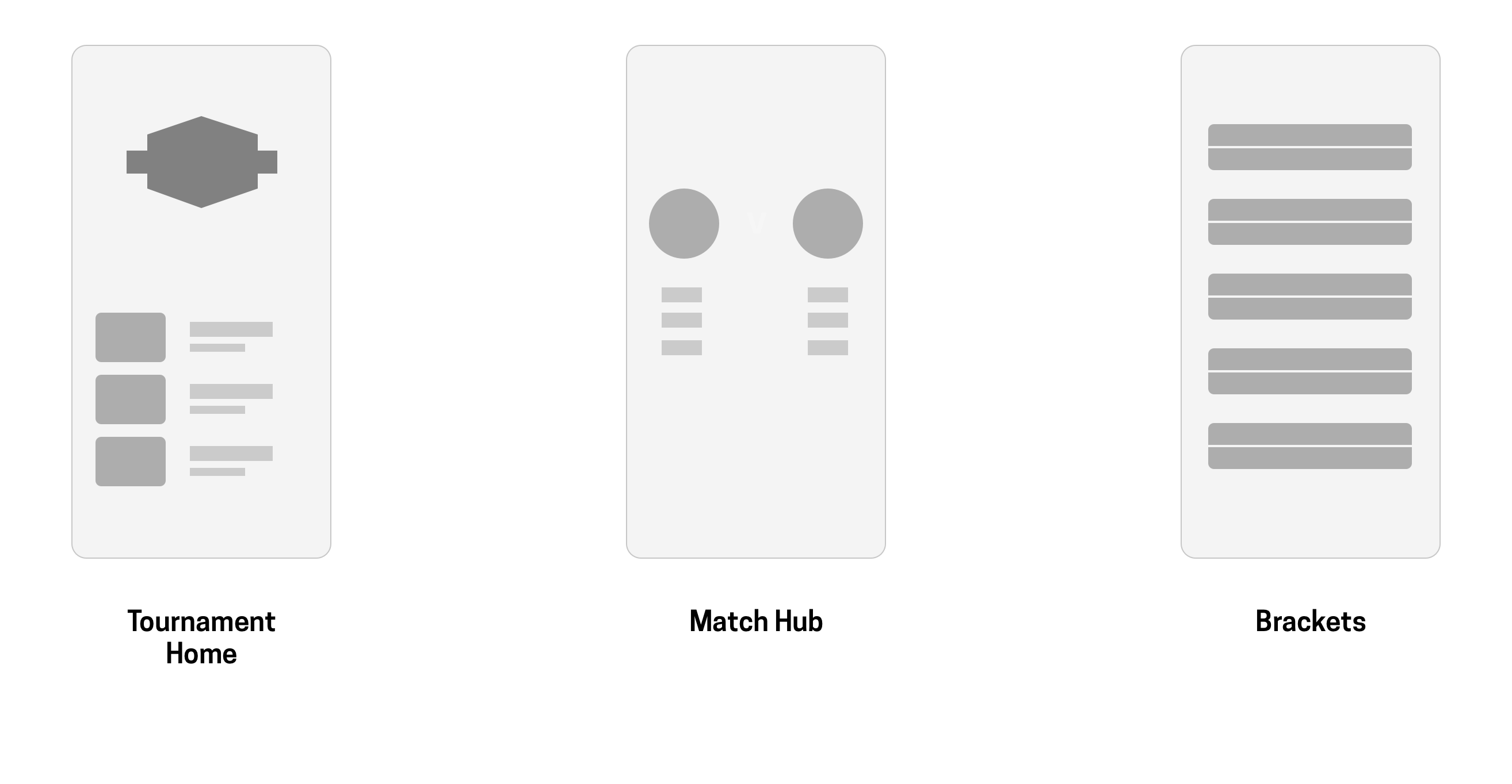
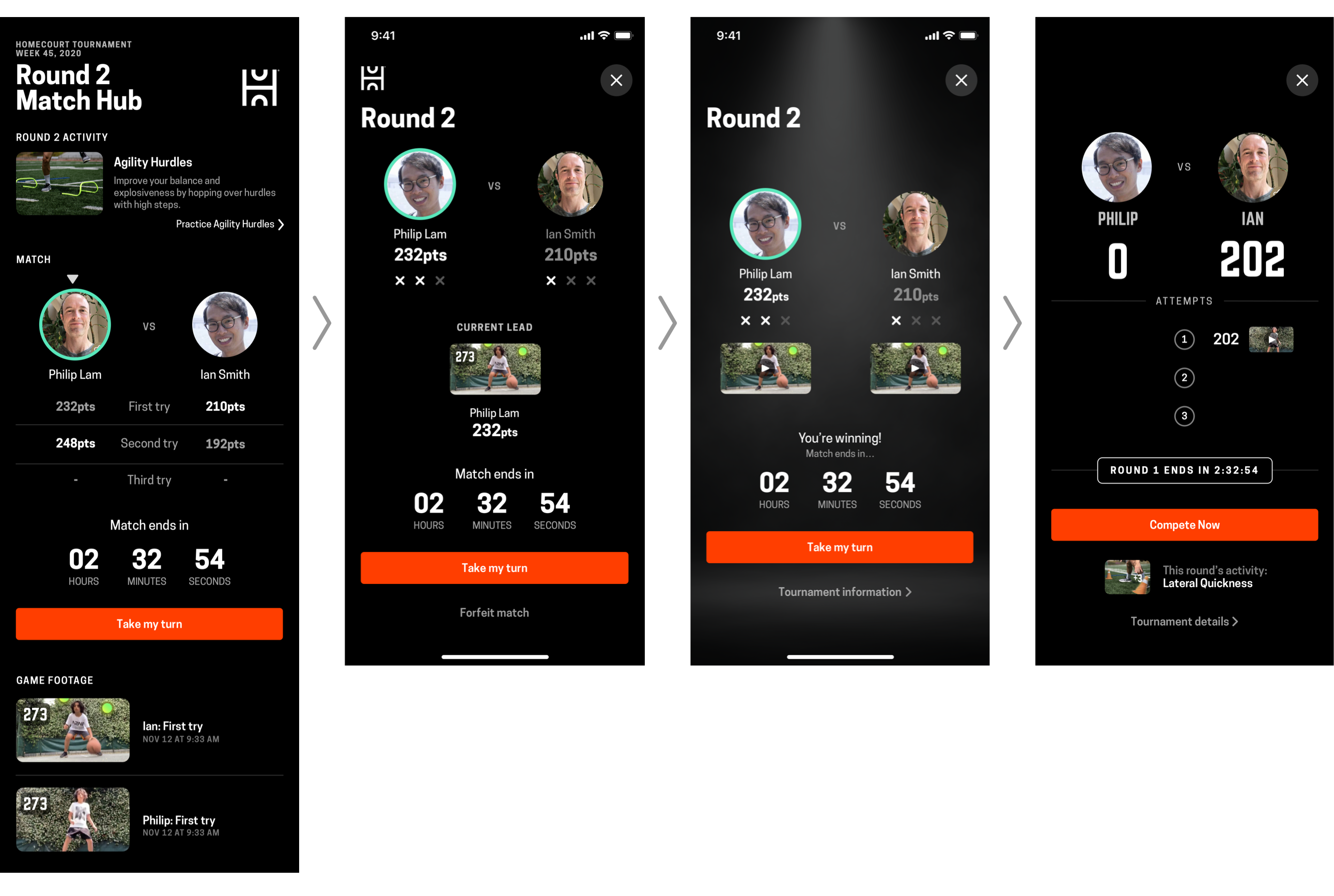
Increased immersiveness with Match Hub
We decided to divide up the tournament screens into three: tournament home, Match Hub and brackets view. Landing page contains general information about the tournament such as the calendar, selected activities, rules and prizes. It's visible to all users whereas the Match Hub is only for the participating users. Match Hub provides everything a player needs to beat their opponent; the opponent's profile, score, performance footage, remaining time and an option to compete. This decision allowed us to
1. Easily differentiate the experience between the participating players and audience. 2. Boost the excitement by creating a "locker room" like space for the players.
Brackets view lets the users, both participant and audience, to browse through other match ups and watch the head-to-head videos. I focused on designing the tournament home and Match Hub.
Phasing out the tournament
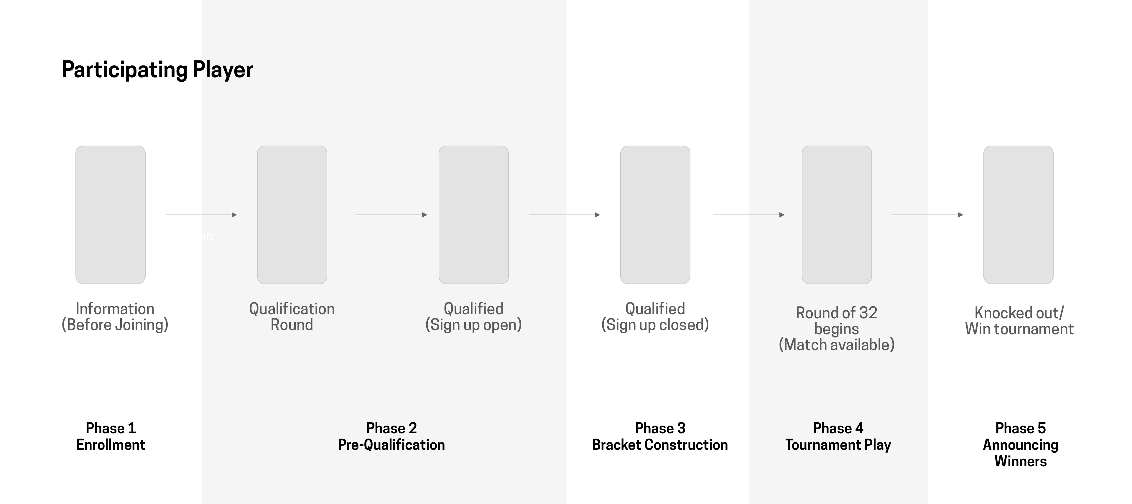
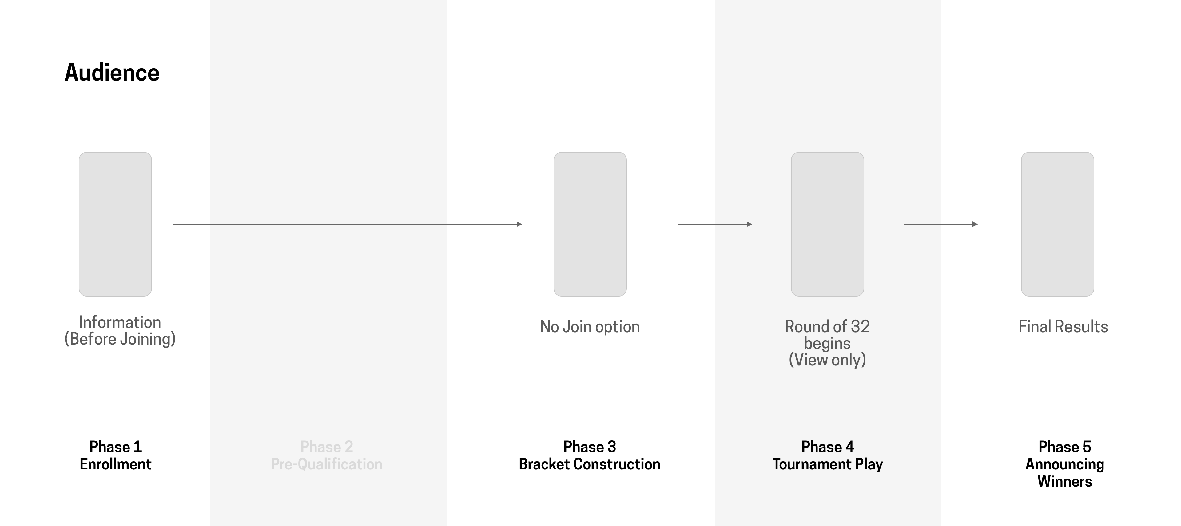
We broke down the tournament into five distinct phases. During the first phase we collect user sign ups as well as promote the event through email, push notification and within the app. Pre-qualification phase overlaps with the first one as it depends on when the individual user signs up for participation. All pre-qualification activities needs to be finished before the third phase. Once our algorithm constructs the brackets based on pre-qualification record, we begin the first day of the tournament. We announce the winners on the last day.
Participant view vs Audience view
There were mainly two scenarios for us to consider. Both particiapant and audience goes through the five phases and the tournament home would have to communicate different information during each phase.
WIREFRAMING
The art of simplification
We began populating the screens with the information needed for each phase. After that, we went through intensive rounds of iteration to cut the information down into its simplest form.
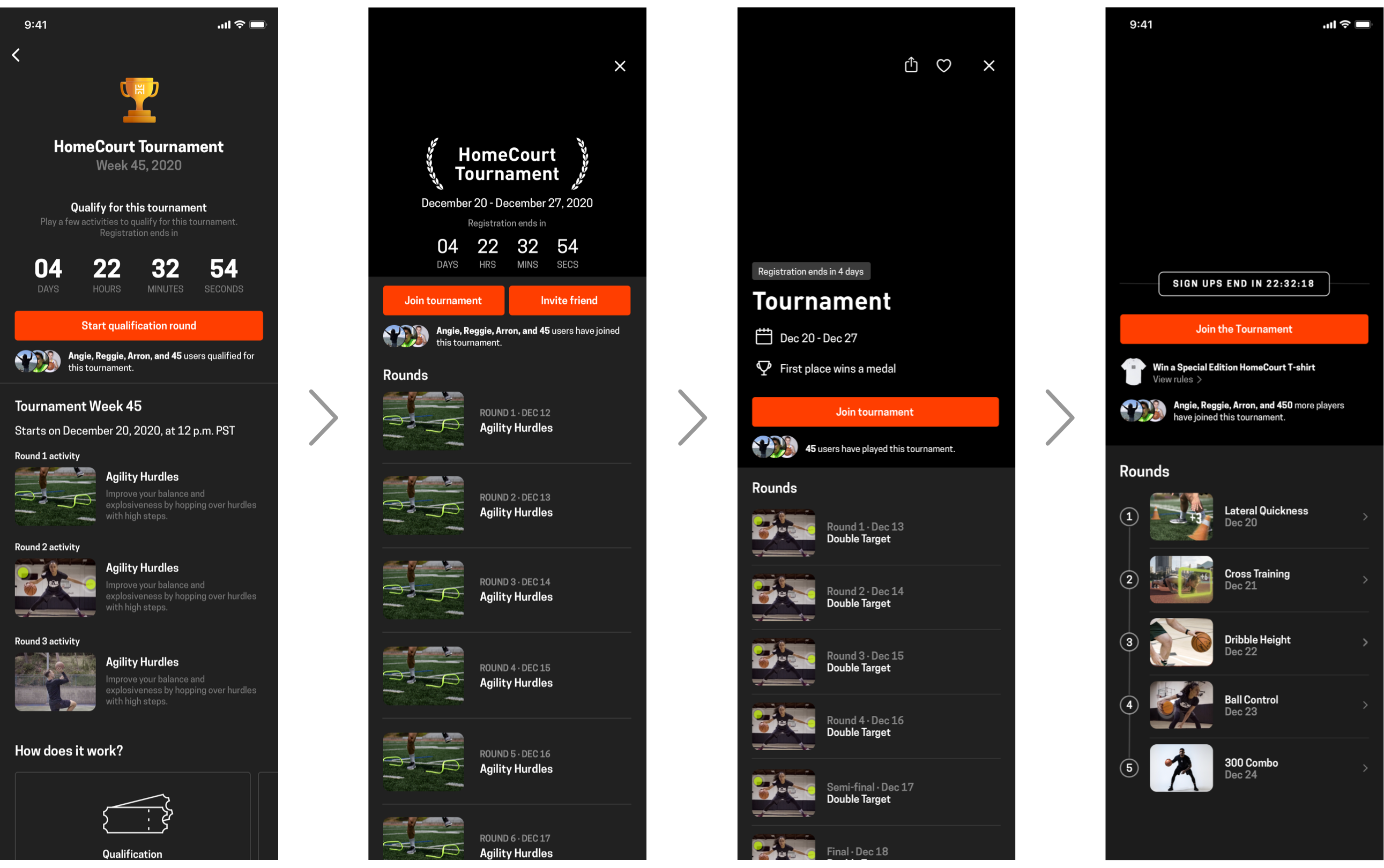
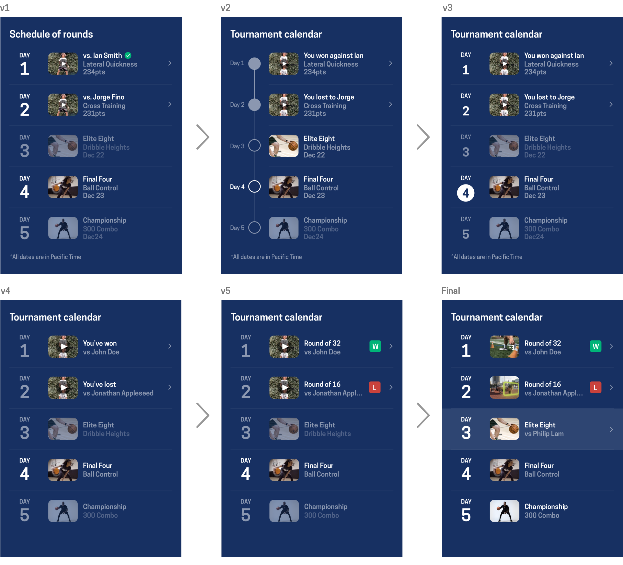
Tournament home
The initial wireframe of the tournament home was lacking visual hierarchy. All key information such as countdown clock, tournament rounds and prize&rule book were equally treated. Through a few rounds of feedback session and iterations, we toned down the the countdown clock and prize&rule book and instead put emphasis on the rounds.
The next challenge was to clearly communciate three things using the list of rounds; schedule, current round and user's match results. Putting all three into single viewport easily cluttered up the screen real estate as well as messed with the clarity. The final version has the least number of different states, consistent with row titles and uses simple visual indicators such as W/L sign or background highlight to communicate supplementary information aside from the schedule.
Match Hub
Match hub went through a similar process but we stressed more on the hierarchy of the information, asking the question of "what do users care the most when they come in to beat their opponent?" We also attempted to fit everything above the fold(812px) to make the Match Hub feel more immersive and actionable.
BRANDING
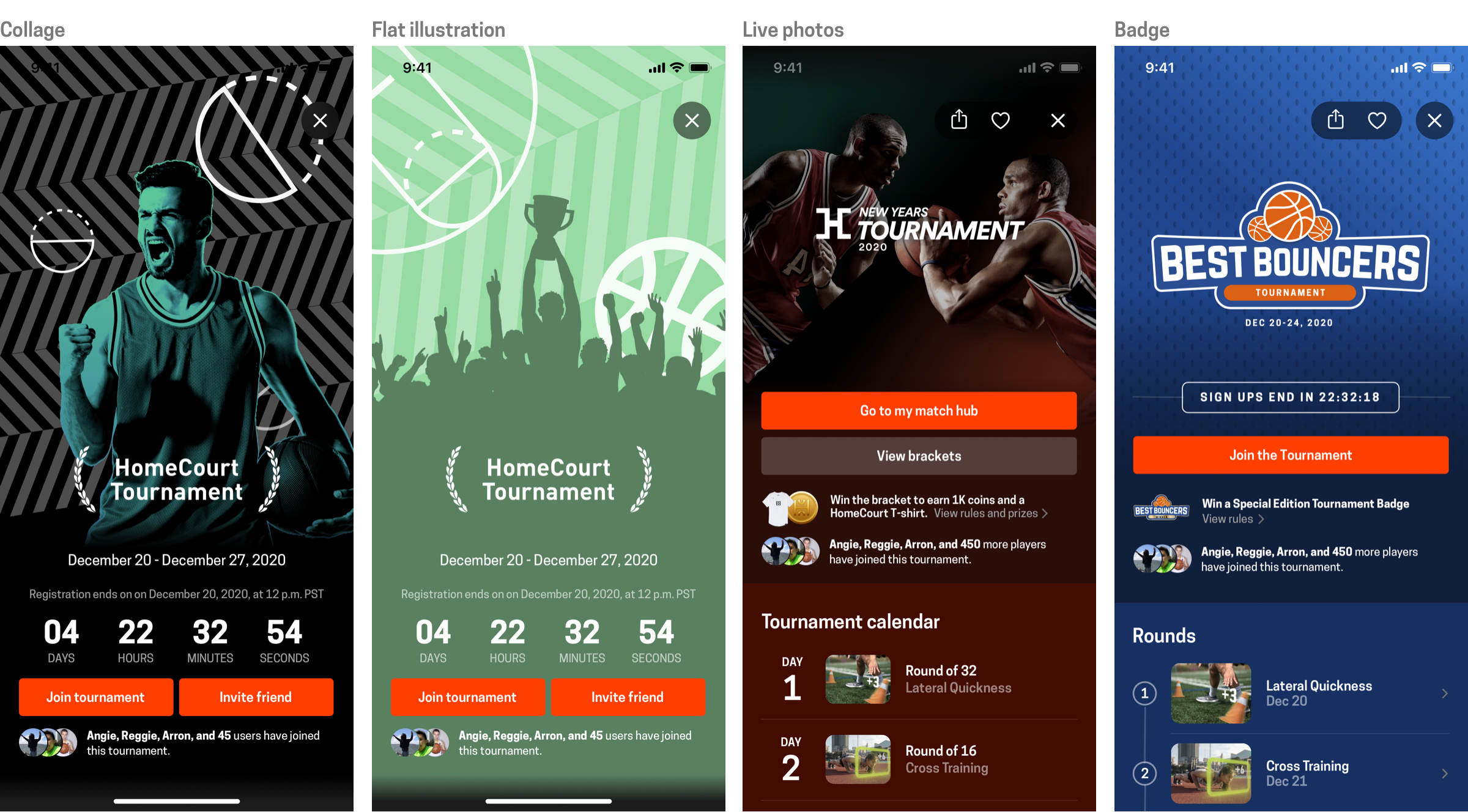
Putting a face on the tournament
The look and feel of the tournament had to be exciting but also systematic enough to enable quick asset swaps everytime we change the theme. We created a moodboard referencing different branding style of sports events and chose a few to make quick version of our own.
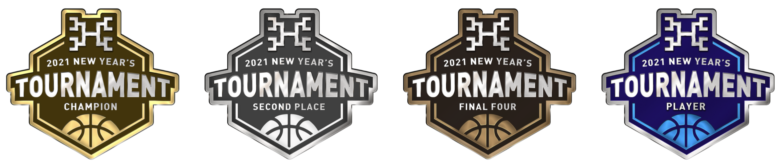
The versatile badge
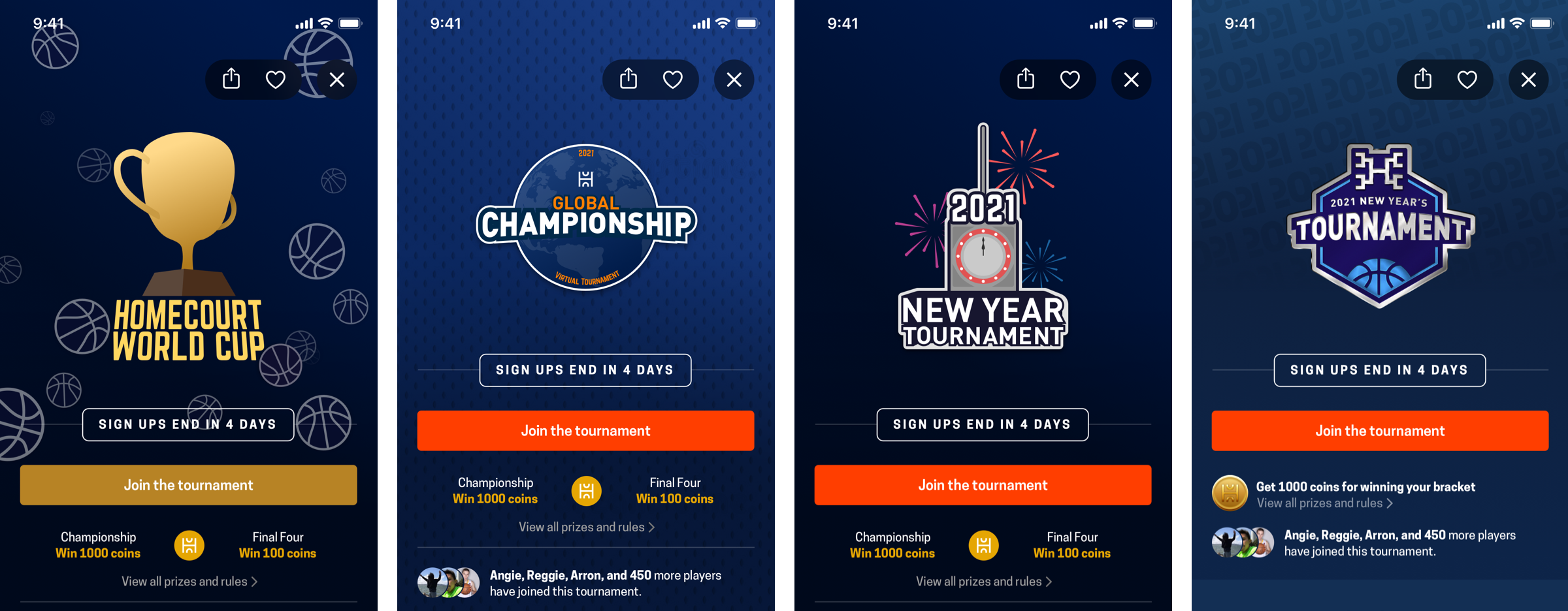
Our team decided to stick to the badge style as it is more sporty, flexible in terms of renewing the theme and can be used as virtual medals as well. We produced a few different versions of the badge and settled on a metalic, hexagonal badge.
We also needed a backdrop that would add to the excitement, align with the 2021 new year theme and help the badge stand out. We made a few iterations to see which one looks the best with the badge on top.
One of the greatest advantage of the badge was that it could be tweaked to be used as a virtual prize for the players. We've fine-tuned the colors to make them look like gold, silver and bronze medals without compromising the legibility.